


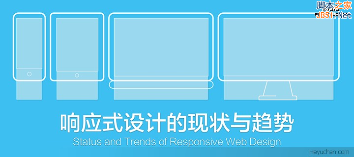
响应式布局
响应式布局在面对不同分辨率设备灵活性强,在平时的网页设计中基本上都要用到响应式布局设计,它给我们提供了良好的用户浏览页面,能带给我们更好的客户体验,下面给大家分享下我做的一个简单的响应式的布局:


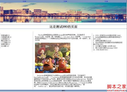
不同的页面会适用不同大小浏览器页面,它会随着分辨率的变化而变化。代码展示如下:
XML/HTML Code复制内容到剪贴板- >
- <html>
- <head>
- <meta charset="utf-8" />
- <title>title>
- <style>
- p{
- font-size: 12px;
- }
- header{
- width: 100%;
- }
- header img{
- width: 100%;
- }
- @media (min-width: 1300px) and (max-width:1400px) {
- #left{
- float: left;
- width: 30%;
- margin: 0px 50px;
- }
- #left #logo-bg{
- margin: 10% 10%;
- width: 80%;
- position: relative;
- }
- #left #logo{
- float: left;
- width: 12%;
- position: absolute;
- left: 13%;
- top: 230px;
- }
- #left p{
- margin-bottom: -20px;
- }
- #left p,h4{
- text-align: center;
- color: red;
- }
- #right{
- float: left;
- width: 60%;
- margin: 15% 0px;
- }
- #right h2{
- text-align: center;
- }
- #right fieldset{
- text-align: center;
- border-left: none;
- border-right: none;
- border-bottom: none;
- }
- #right fieldset legend{
- padding: 0px 20px;
- }
- #fen{
- width: 100%;
- -webkit-column-count: 6;
- -moz-column-count: 6;
- -o-column-count: 6;
- -ms-column-count: 6;
- column-count: 6;
- -webkit-column-gap: 1em;
- -moz-column-gap: 1em;
- -o-column-gap: 1em;
- -ms-column-gap: 1em;
- column-gap: 1em;
- }
- #fen img{
- width: 100%;
- border-radius: 10px 10px 10px 10px;
- }
- #fen p,h4{
- text-align: center;
- color: red;
- }
- #fen p{
- margin-bottom: -20px;
- }
- #di p{
- text-align: center;
- }
- #di p span{
- color: red;
- }
- }
- @media (min-width: 1000px) and (max-width:1300px){
- #left{
- float: left;
- width: 30%;
- margin: 0px 50px;
- }
- #left #logo-bg{
- margin: 10% 10%;
- width: 80%;
- position: relative;
- }
- #left #logo{
- width: 12%;
- position: absolute;
- left: 14%;
- top: 190px;
- }
- #left p{
- margin-bottom: -20px;
- }
- #left p,h4{
- text-align: center;
- color: red;
- }
- #right{
- float: left;
- width: 60%;
- margin: 15% 0px;
- }
- #right h2{
- text-align: center;
- }
- #right fieldset{
- text-align: center;
- border-left: none;
- border-right: none;
- border-bottom: none;
- }
- #right fieldset legend{
- padding: 0px 20px;
- }
- #fen{
- width: 100%;
- -webkit-column-count: 3;
- -moz-column-count: 3;
- -o-column-count: 3;
- -ms-column-count: 3;
- column-count: 3;
- -webkit-column-gap: 1em;
- -moz-column-gap: 1em;
- -o-column-gap: 1em;
- -ms-column-gap: 1em;
- column-gap: 1em;
- }
- #fen img{
- width: 100%;
- border-radius: 10px 10px 10px 10px;
- }
- #fen p,h4{
- text-align: center;
- color: red;
- }
- #fen p{
- margin-bottom: -20px;
- }
- #di p{
- text-align: center;
- }
- #di p span{
- color: red;
- }
- }
- style>
- head>
- <body>
- <header>
- <img src="img/rag.png" />
- header>
- <aside id="left">
- <img src="img/logo-bg.png" id="logo-bg"/>
- <img src="img/logo.png" id="logo" />
- <hr />
- <p>THEp>
- <h4>WEBLOCUEh4>
- <hr />
- <p>THEp>
- <h4>WEBLOCUEh4>
- <hr />
- <p>THEp>
- <h4>WEBLOCUEh4>
- <hr />
- aside>
- <article id="right">
- <h2>“Give me problems, give me work.”h2>
- <p>In the year 1878 I took dogree of Doctor of Medicline of the Unibertive of the London and problems to Netbody to go through the course,In the year 1878 I took dogree of Doctor of Medicline of the Unibertive of the London and problems to Netbody to go through the course,In the year 1878 I took dogree of Doctor of Medicline of the Unibertive of the London and problems to Netbody to go through the course.p>
- <p>In the year 1878 I took dogree of Doctor of Medicline of the Unibertive of the London and problems to Netbody to go through the course,In the year 1878 I took dogree of Doctor of Medicline of the Unibertive of the London and problems to Netbody to go through the course,In the year 1878 I took dogree of Doctor of Medicline of the Unibertive of the London and problems to Netbody to go through the course.p>
- <fieldset><legend>victorslegend>fieldset>
- <div id="fen">
- <img src="img/1.jpg" />
- <p>SETCOMEp>
- <h4>HOLEMESh4>
- <img src="img/2.jpg" />
- <p>SETCOMEp>
- <h4>HOLEMESh4>
- <img src="img/3.jpg" />
- <p>SETCOMEp>
- <h4>HOLEMESh4>
- <img src="img/4.jpg" />
- <p>SETCOMEp>
- <h4>HOLEMESh4>
- <img src="img/5.jpg" />
- <p>SETCOMEp>
- <h4>HOLEMESh4>
- <img src="img/6.jpg" />
- <p>SETCOMEp>
- <h4>HOLEMESh4>
- div>
- <fieldset><legend>*legend>fieldset>
- <div id="di">
- <p>In the year 1878 I took <span>Suing tablespan> dogree of Doctorp>
- <p>What the year 2016 I took dogree <span>Ruing roidspan> of Doctorp>
- div>
- article>
- body>
- html>
做的不够严谨,因为时间问题,请见谅。
以上这篇响应式布局的简单案例就是小编分享给大家的全部内容了,希望能给大家一个参考,也希望大家多多支持潘少俊衡。
原文地址:http://www.cnblogs.com/duzheqiang/p/5666465.html
版权声明
本文仅代表作者观点,不代表本站立场。
本文系作者授权发表,未经许可,不得转载。
本文地址:/web/CSS/77742.html